Given our constructive economic and market outlook, we believe the market will ultimately climb today’s wall of worry higher as several of investors’ leading fears are assuaged.
Rising Unemployment: Closer Look, Different Conclusion
Key Takeaways
- A rising unemployment rate and triggering of the Sahm rule has spooked financial markets in recent weeks. However, a deeper analysis shows that increasing labour supply, rather than growing job losses, has been the primary driver of the pickup in unemployment.
- Alternative approaches to analysing labour data yield a similar, less-worrisome conclusion and support the notion that the job market is best characterised as normalising from extreme tightness in the post-pandemic period.
- With a minimal increase in workers losing their jobs, the outlook for future consumption should remain supportive and contribute to a continuation of the current expansion.
Over the past several years several traditional recessionary signals have become less reliable, posing a challenge for macroeconomists and financial markets. We have long believed that taking any recessionary signal at face value can be fraught with peril, and instead seek to understand the “why” behind any indicator. Such analysis leads us to conclude that the recent triggering of the Sahm rule may be less concerning than suggested by the response in financial markets.
The Sahm rule states that “when the 3-month moving average of national unemployment is 0.5 percentage point or more above its low over the prior twelve months, we are in the early months of a recession”.1 It is important to note that this observation is just that, - an observation, not a causal rule. In fact, U.S. Fed Chair Jerome Powell described the Sahm rule as a “statistical regularity”2 when asked about it at last month’s Federal Open Market Committee press conference.
This isn’t to say the Sahm rule isn’t useful. Underpinning this statistical regularity are dynamics that can help inform the discussion of recessionary risk. One of those dynamics is inertia, or the notion that an object in motion tends to stay in motion. Historically, a 0.5 percentage point increase in the unemployment rate has presaged a much larger non-linear increase. Put differently, a steady drip of layoffs eventually leads to the dam breaking and, once it does, the water (job losses) comes gushing through. There is nothing magical about the 0.5 percentage point threshold. Rather, we believe the cutoff is best viewed as a level that has historically lined up well with the early innings of past recessions.
Exhibit 1: The Sahm Rule and Recessions
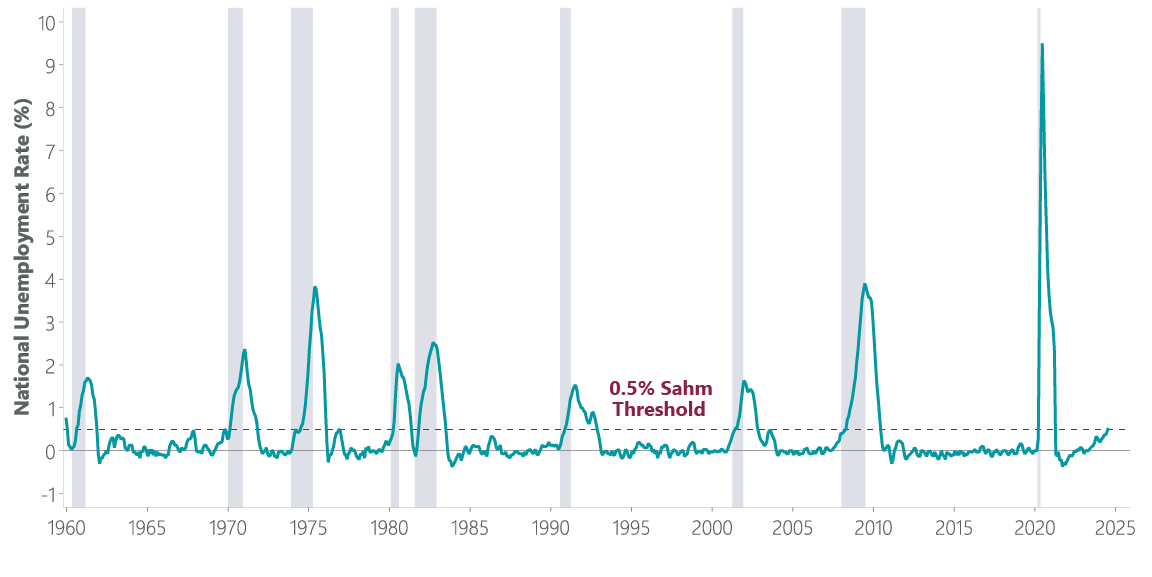
Grey bars indicate recession. Data as of 2 August 2024. Sources: Federal Reserve Bank of St. Louis, Macrobond.
It might be natural to question “how much” wider this measure needs to go before investors should worry, however we think the better question is “why” does the Sahm rule work. A second underlying dynamic that the Sahm rule utilises is the historically tight relationship between labour income and consumption. Labour income is the primary source of spending power for the typical American, so an increase in job losses is concerning for the economy as spending would be expected to decline proportionally. This explains why the economy has historically slipped deeper into a recession once the Sahm rule has been triggered. This may be a feature and not a bug of the Sahm rule, which was designed not as a recessionary signal but rather to guide policymakers in deciding when fiscal support for the economy should be deployed.
Exhibit 2: Labour Income Drives Consumption
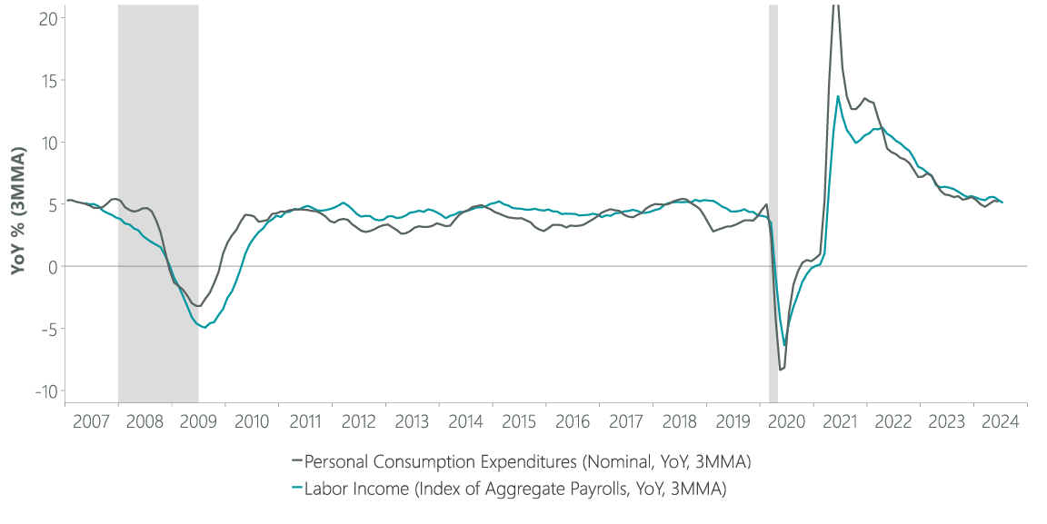
Grey bars indicate recession. Data as of 2 August 2024. Sources: U.S. Bureau of Labor Statsitics (BLS), U.S. Bureau of Economic Analysis (BEA), Macrobond.
A Closer Look at the Recent Rise in Unemployment
Since reaching a low of 3.4% in April 2023, the national unemployment rate (U3) has risen to 4.3% and the total number of unemployed persons in the U.S. has increased by nearly 1.5 million. In Sahm rule terms, the 3-month moving average of the national unemployment rate stands at 4.13% (using a rounded unemployment rate as the FRED database does) and the low over the prior 12 months is 3.60%, meaning the rule has been triggered by the 0.53% percentage point increase.
That said, we believe a deeper dive into the underlying drivers of the rising unemployment rate shows less reason for worry than the triggering of the Sahm rule suggests. The unemployment rate is defined by the Bureau of Labor Statistics (BLS) as “the number of unemployed people as a percentage of the labour force (the sum of the employed and unemployed)”.3 Importantly, some people are classified as unemployed if they do not have a job but are actively looking for work. This means that the unemployment rate can change for several reasons including a person losing a job or an increase in the number of people who were on the sidelines but are now looking for employment.
While either of these dynamics can trigger the Sahm rule, the economic implications of a rising unemployment rate due to an increase in job losses is far different from a rising unemployment rate due to an increase in the number of people seeking employment. The former dynamic represents a loss of labour income (reducing the outlook for future consumption) while the latter dynamic does not. This crucial distinction can only be made by taking a closer look at the data.
There are multiple ways to evaluate “why” the unemployment rate is rising. One is to utilise the classifications assigned to unemployed persons: Job Losers, Job Leavers, Re-entrants (to the labour force) and New Entrants. The former two classifications typically represent a loss of income, whereas the latter two usually do not. In looking at the 12-months prior to past instances of the Sahm rule being triggered since 1967 ( the farthest back the data for these classifications goes), our analysis shows that 83% of the increase in the number of unemployed people has come from Job Losers and Job Leavers on average, with just 16% coming from Re-entrants and New Entrants (the total does not sum to 100% due to rounding). If the 1981 double-dip recessions are excluded given that many Re-entrants at the time were likely employed prior to the 1980 recession and thus may be more appropriately thought of as Job Losers than Re-entrants, the breakdown would stand at 87% and 12%.
The present situation bears little resemblance to these past periods, however. Over the past year, 32% (twice the historical average inclusive of 1981) of the increase in unemployment has come from Re-entrants and New Entrants. If we focus on 2024 specifically – the period when the unemployment rate began to persistently rise – the share from Re-entrants and New Entrants is an even higher 51%, or more than 3x the historical norm. This unique dynamic has even been noted by Claudia Sahm, the rule’s namesake. Specifically, she observed that “the Sahm rule is likely overstating the labour market’s weakening due to unusual shifts in the labour supply caused by the pandemic [Re-entrants] and immigration [New Entrants]”.4
Exhibit 3: Breaking Down Rising Unemployment by Reason for Unemployment

YTD data, as of 31 July 2024. Sources: BLS, Bloomberg.
The classifications of unemployment are not the only way to analyse why unemployment is rising. A second approach utilises what is known as labour force status flows. This data looks at the flow of people moving between the “states” – Employed, Unemployed, Not in Labour Force – a person can be in with regard to the labour force in a given month. This “flows” approach is slightly different from what has been outlined above, which evaluates the difference between a “stock ” at two points in time. While the concepts are similar, there are important nuances and distinctions between them. Ultimately, we believe both approaches can be illustrative and are complementary to one another.
The underpinnings for the labour flows approach come from the “bathtub model”, which treats the number of unemployed persons as water in a bathtub with a flow from the faucet (newly unemployed people) raising the water level and a simultaneous flow out the drain (hires and labour force exits) lowering the water level. This concept can be used in a number of ways, including to forecast the unemployment rate itself with statistically significant results5 by evaluating the relative rate of inflows as compared with outflows.
It can also be used in an explanatory fashion to evaluate “why” unemployment is rising. By focusing on the net flows between specific state pairs in isolation, we can calculate how much of the change in unemployment is the result of net hiring (net flows between Unemployed and Employed) as opposed to flows from people moving in and out of the labour force. This approach shows that, on balance, far more people have cumulatively moved from Unemployed to Employed than in the other direction in 2024 (and 2023 as well). This suggests strong net hiring and that net flows into the labour force account for more than all of the increase in the unemployment rate so far this year.
Exhibit 4: Breaking Down Rising Unemployment by Labor Force Status Flows

Note: sums do not add due to rounding. YTD data, as of 31 July 2024 Sources: BLS, Bloomberg.
Unfortunately, this dataset only commences in 1990 meaning historical comparisons of this dataset have limited value. That being said, we believe this approach supports the conclusion that a substantial portion of the increase in unemployment is the result of a growing labour force as opposed to an increase in job losses, and thus the outlook for future consumption is not as severe as the pickup in unemployment alone would suggest. We do not rely on this analysis alone to drive our conclusions, however. Rather, we look for supporting evidence such as the “prime age” labour force participation rate – the share of 25–54-year-olds who are currently employed or looking for work – which currently stands at its highest level in over 20 years, consistent with the notion of robust growth in the size of the labour force.
An additional resource we have used to triangulate these views comes from an entirely different BLS dataset, the Job Openings and Labor Turnover Survey (JOLTs). While this dataset is typically utilised for its information regarding job openings and quit rates, its various components offer broad insights into the overall health of the labour market. One approach is to evaluate the ratio of Hires to Separations, conceptually similar to the bathtub model’s flow approach. This dataset has a similarly limited history to the Labour Force Status Flows – in this case only dating back to 2001 – and shows an increasing number of hires per separation over the past few quarters. Crucially, this data is inconsistent with an increase in unemployment from rising job losses given that more hires than separations have been occurring.
Exhibit 5: Ratio of Hires to Separations
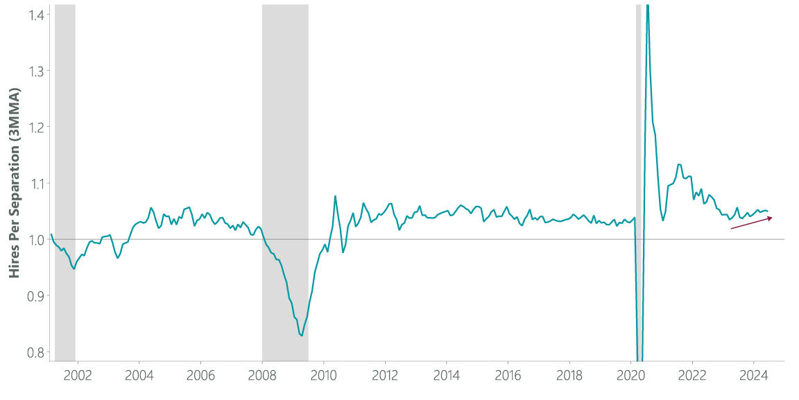
Grey bars indicate recession. Data as of 30 July 2024. Sources: U.S. Bureau of Labor Statsitics (BLS), NBER, Macrobond.
Labour Market Best Characterised as Normalising
We would be remiss not to note that the JOLTs report itself is broadly consistent with the notion of labour normalisation. The labour market of a few years ago was incredibly tight coming out of the pandemic and firms struggled to find enough workers. Posted job openings surged during this period, as did wages, when the demand for labour outpaced available supply. Over the past two years, the labour market has come into a better balance and posted job openings have fallen while the pace of wage gains has cooled.
Exhibit 6: JOLTs Data Supports Labour Market Normalisation
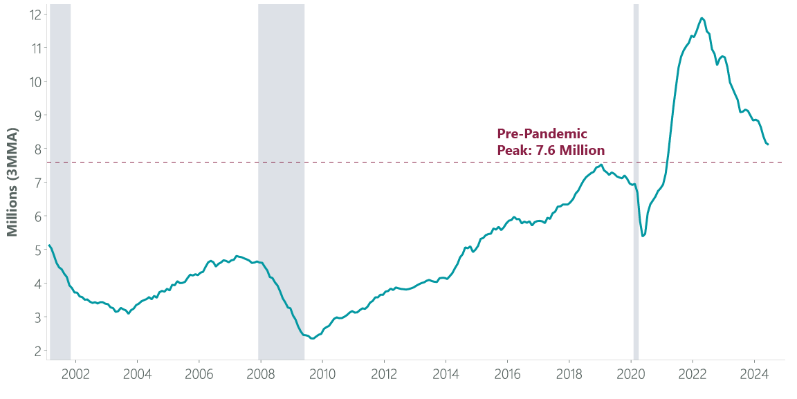
Grey bars indicate recession. Data as of 30 July 2024. Sources: U.S. Bureau of Labor Statsitics (BLS), Macrobond.
Importantly, job openings remain above their pre-pandemic peak and may have started to stabilise in recent months. Leading indicators of the “official” JOLTs job openings data such as the Indeed Job Postings Index6 suggest the next several months should show further signs of stabilisation and help round out a broader picture of a rebalancing labour market.
One result of labour market normalisation has been a slower pace of hiring. This has also likely contributed to a higher unemployment rate. If there are fewer positions being filled in any given month, it should take an individual longer to find a job, all else equal. This means there will be more individuals in the unemployed “state” when there is less hiring (or churn) going on in the labour market.
The data bears this out as the median duration of unemployment has risen by about 1.5 weeks over the past two years, to 9.4 weeks at present. While this might sound concerning, it is actually in-line with the 9.3-week average seen during the last two years of the prior economic expansion (2018-19), a period generally seen as being consistent with the concept of “maximum employment” and a generally healthy economic and labour environment. Putting this all together, labour market normalisation has also contributed to a portion of the increase in the unemployment rate, providing another point of calibration for the notion that the rise in the unemployment rate may not be fully what it seems.
Data Issues Muddying the Water?
An additional factor that may be contributing to a rise in the unemployment rate that wouldn’t be consistent with a budding recession is the possibility that the underlying data itself could be distorted. The inputs used to calculate the unemployment rate come from the “household survey” part of the jobs report, whereas the headline non-farm payrolls (jobs) numbers come from a different dataset known as the “establishment survey”. Over the past few years, these surveys have diverged, with the establishment survey showing more than double the number (~2.5 million) of jobs created in 2023 and 2024. If the household survey is undercounting the number of workers, the unemployment rate may be overstated.
Historically, the household survey has been more “right” than the establishment survey at inflection points for the labour market and broader economy. However, the last few years have seen the establishment survey become more “right” as normal periodic revisions to the household survey have been more substantial and present a picture that ultimately looks closer to what has been seen from the establishment survey data. Additionally, the gold-standard jobs data known as the Quarterly Census of Employment and Wages (QCEW) has more closely aligned to the establishment survey in recent years. This means that when the dust settles and later regular revisions are made, it could well be the case that the household survey has been undercounting the number of employed persons in the U.S., and the unemployment rate could actually be lower than is currently perceived. This may also be a function of the surge in immigration over the past few years, as the household survey likely undercounts relatively newly arrived immigrants.
The QCEW has also shown that the strength implied by the establishment survey may be a bit overstated. Some of this overstatement could be the result of an adjustment known as the net birth-death model, which adjusts hiring data to reflect job gains from newly created businesses and job losses from firms that have recently closed. This is where the historical tendency of the household survey being more “right” at inflections tends to come from, as the net birth-death model isn’t updated each month and can thus overstate business formation (and related hiring) and undercount businesses closing (and related job losses). Business formation remains robust, however, suggesting this worry may be overstated at present.
Exhibit 7: Business Formation Remains Robust
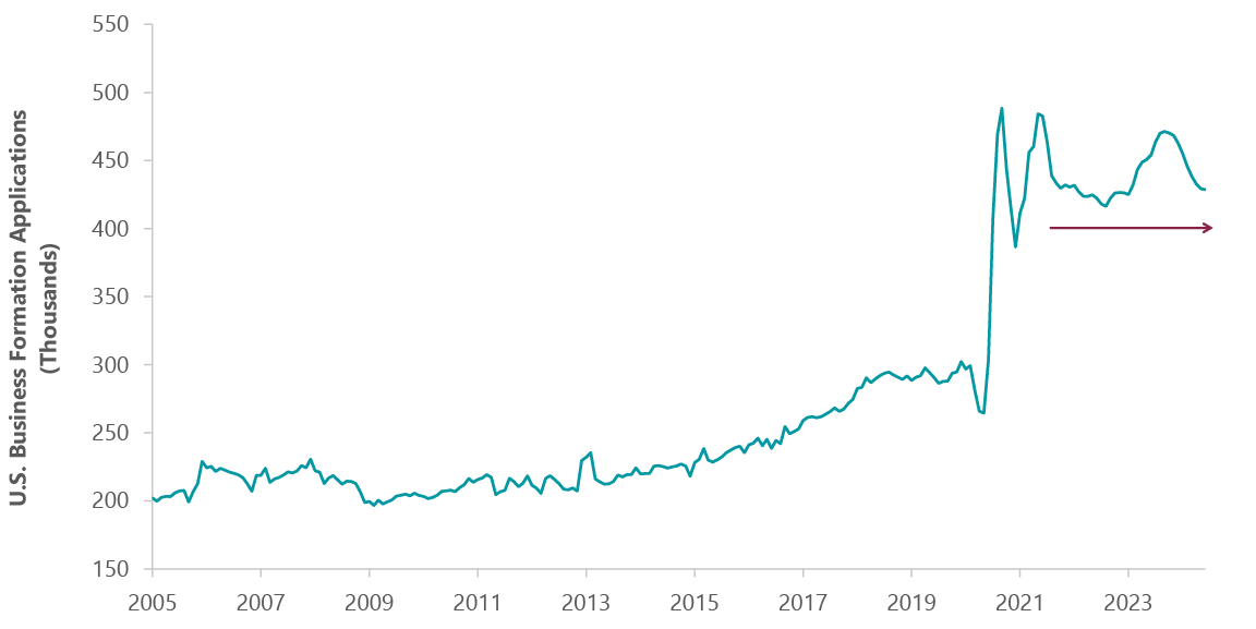
Data as of 30 June 2024. Sources: Census Bureau, Bloomberg. Note: 3-Month Moving Average.
Ultimately, delving into which survey is more accurate and why could constitute an entirely separate paper. Given that over the past few years the QCEW data has come in closer to the establishment survey than the household survey, we believe the rise in the unemployment rate (which relies on the lately less accurate household survey) may not be fully as it appears. Researchers affiliated with the Federal Reserve Bank of Atlanta’s Center for Quantitative Economic Research recently came to a similar conclusion and found that while the net birth-death model may be overstating the strength of the establishment data, most of the discrepancy between the household and establishment surveys is “likely due to an underestimation of population growth in the CPS, potentially linked to recent immigration fluctuations.”7 The CPS (Current Population Survey) is akin to the household survey. The simple fact that there is an ongoing debate in macroeconomic circles about this subject in the first place suggests caution is warranted in taking the unemployment rate at face value.
A final piece of evidence in support of our thesis comes from the weekly initial jobless claims data. Jobless claims are one of the indicators on the ClearBridge Recession Risk Dashboard, a set of 12 signals we track to gauge the state of the economic cycle, and are what we have been referring to as the “economic canary in the coalmine” for the past few years. Jobless claims measure the number of people filing for unemployment benefits in any given week, and the number of first-time filers (initial claims) provides a high-frequency reading on the number of layoffs occurring.
Historically, jobless claims and the unemployment rate have largely moved in lockstep – as more workers lose their jobs the unemployment rate moves higher, and vice versa. However, this is not what has been happening lately. While the unemployment rate has risen by 0.8% (from 3.5% year-over-year to 4.3%) over the past year, the number of initial jobless claims being filed today is actually lower than it was last year. In fact, the number of initial jobless claims has been lower than the same week in the year prior over 10 of the last 13 weeks (the length of a quarter) and in 22 of the 32 weeks for which there is data this year.
Exhibit 8: Jobless Claims Suggest Healthy Employment Picture

Data as of 9 August 2024. Sources: Department of Labor, Bloomberg.
While this data does not show an accelerating layoff cycle at present, a keen observer may note several possibly concerning dynamics from the chart above: 1) jobless claims have been trending higher, 2) they were above 2023 levels a few weeks ago, and 3) the dataset appears quite bumpy, meaning it can be hard to trust any single week’s data. These are all valid concerns.
However, they can all be explained in a manner that should assuage most fears. The rise in jobless claims in recent months is likely the result of seasonal noise. This data is seasonally adjusted, but the process for doing so appears to have broken down in the wake of the pandemic. This is true in other datasets as well (inflation comes to mind), but both 2023 and 2024 have seen a sizeable spike in claims over the summer and 2024 appears to be closely following 2023’s pattern. This may be a function of scheduled shutdowns at automobile factories as well as changes in the last few years that now allow some public education employees to file for benefits during school vacations (including the summer) in certain places including New York City. Ultimately the seasonal adjustment process should adapt to incorporate these shifts, but it does not yet appear that this has happened.
This is, in part, why we evaluate initial claims on a year-over-year basis. We also look at the non-seasonally adjusted data, which shows 10 of the last 13 weeks and 22 of 32 so far this year tracking lower than the same week in 2023. We believe this further bolsters the case that seasonal noise has been the primary driver of the recent uptrend. The timing of holidays or extreme weather events can also distort these comparisons in any given week, but over longer periods these issues tend to cancel out.
The second concern regarding the recent pickup above 2023 levels in July was likely the result of an early hurricane, as Texas – impacted by Hurricane Beryl – was a clear outlier in the data and a major contributor to higher claims in those weeks. Finally, the week-to-week volatility is why this data is typically evaluated on a four-week moving average basis. We are always hesitant to read too much into any single week’s data and note that looking at this data on a smoothed basis yields the same conclusion that initial claims have been trending lower (than last year) for most of this year. Simply put, the initial jobless claims do not show that layoffs are currently a worsening problem, in our view.
Could Focusing Too Closely on the Details Contribute to a Misread?
Layoffs holding steady may not preclude a recession from unfolding, however, given the non-linear nature of the Sahm rule dynamics in the first place. A steady pace of layoffs could eventually burst the dam, so to speak. We do not believe this is what is happening at present given the jobless claims data, but does constitute a risk to our outlook. We believe that this general risk is the primary way our analysis could ultimately prove to be wrong; that enough layoffs eventually happen and a non-linear dynamic takes hold. We do not see evidence suggesting anything of the sort at present, but it remains a valid concern.
There are of course other ways our conclusion could be wrong as well, for example if the underlying data we are utilising is later revised such that there has instead been a less favourable mix of labour force entrants relative to job losers and leavers within unemployment. And of course, a downturn in the economy could be sparked by an entirely different dynamic than a layoff cycle, such as an exogenous shock.
A Different Conclusion: Rising Unemployment of Less Concern Than Typical
Ultimately, we believe our research broadly supports the conclusion that the rise in the unemployment rate should be of less concern at present than the triggering of the Sahm rule implies. While the specifics of just how much less are beyond the scope of this paper, we believe that the negative economic impact from weakening labour is not yet sufficient to trigger the non-linear recessionary response. Put differently, the rise in the unemployment rate today is equivalent to something less than the 0.53% increase that has triggered the Sahm rule, a notion Claudia Sahm herself has concluded.
We believe the dynamics that have contributed to this less-worrisome rise in the unemployment rate – including increasing labour supply as opposed to rising job losses, as well as broader labour market normalisation – have not yet fully played out. As a result, it would not be a surprise to see the unemployment rate continue to drift higher in the coming months and settle out in the mid-4% range consistent with a soft landing. If that scenario transpires, the recent equity market pullback – which was partially driven by what we believe are misplaced fears around the triggering of the Sahm rule – may prove to be a compelling buying opportunity for long-term investors.
1 Claudia Sahm, “The Sahm rule: I created a monster,” Stay-At-Home-Macro, December 30, 2022, https://stayathomemacro.substack.com/p/the-sahm-rule-i-created-a-monster
2 U.S. Federal Reserve, “Transcript of Chair Powell’s Press Conference,” July 31, 2024, https://www.federalreserve.gov/mediacenter/files/fomcpresconf20240731.pdf
3 U.S. Bureau of Labor Statistics, https://www.bls.gov/cps/definitions.htm#ur.
4 Claudia Sahm, “Sahm-thing more on the Sahm rule,” Stay-At-Home Macro, July 26, 2024, https://stayathomemacro.substack.com/p/sahm-thing-more-on-the-sahm-rule.
5 Regis Barnichon and Christopher J. Nekarda, “The Ins and Outs of Forecasting Unemployment: Using Labor Force Flows to Forecast the Labor Market,” Brookings Institute, September 2012, https://www.brookings.edu/wp-content/uploads/2012/09/2012b_barnichon.pdf.
6 Allison Shrivastava and Nick Bunker, “July 2024 Labor Market Update: Slowdown in Posted Wage Growth Suggests the Market Has Found a Groove,” Hiring Lab, July 11, 2024, https://www.hiringlab.org/2024/07/11/july-labor-market-update-slowdown-posted-wage-growth/.
7 Jonathan L. Willis and Tao Zha, “What Accounts for the Growing Divergence between Employment Measures?” Federal Reserve Bank of Atlanta, August 2024, https://www.atlantafed.org/research/publications/policy-hub/2024/08/12/06--what-accounts-for-growing-divergence-between-employment-measures.
Related Perspectives


