Although markets often pause to digest after large gains, history suggests these episodes usually prove fleeting, meaning major indexes could move higher in the second half of 2026.
Anatomy of a Recession
AOR Update: Not Your Father's Energy Crisis
Key Takeaways
- Worries about an economic slowdown caused two market-focused recession indicators, Commodities and Credit Spreads, to worsen from green to yellow, yet the overall Recession Risk Dashboard remains green.
- Spiking oil prices have raised recessionary fears reflecting the experience of the 1973 Arab oil embargo. A review of the dashboard during that period provides a useful case study about what could turn the contraction experienced in the first quarter into a full-blown recession.
- While some elements of the 1973-75 period bear resemblance to the current environment -- higher fiscal spending, looser monetary policy and positive demographics -- there are several key differences. The magnitude of the current energy shock pales in comparison to 1973 and today’s economy is starting from a much stronger foundation.
Negative GDP Print More Anomaly Than Warning Sign
The U.S. economy contracted by 1.4% in the first quarter, the first decline since the pandemic plunge during the second quarter of 2020. There is more to the story, however, given a -2.5% contribution from (stronger) imports as supply chain bottlenecks loosened. This paradox – a positive development (supply chain improvement) led to a negative headline outcome (a drag on GDP) – perhaps explains why financial markets treated the GDP report as “good news,” with equities rallying 2.5% that day. More stable core components of GDP, like consumption and investment, have accelerated over the past two quarters, which bodes favorably for a growth rebound in the current quarter. A negative GDP print outside of a recession is not unprecedented, with over 20% of such contractions occurring since 1950, the latest being in 2014 and 2011.
The economic outlook bears little resemblance to the early pandemic, with consumption and business activity likely to slow from elevated levels but remain positive. Earnings are growing at a healthy clip. With approximately 75% of S&P 500 companies having reported so far, earnings beats have been robust and widespread, and guidance has been better than average.
Exhibit 1: ClearBridge Recession Risk Dashboard
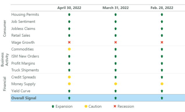
Source: ClearBridge Investments.
Despite this, Credit Spreads widened as perceptions of an economic slowdown and rising geopolitical risks led investors to demand greater compensation for investing in lower-quality bonds. Commodities worsened to yellow due to Chinese lockdowns curbing demand for industrial commodities such as copper and steel, while the ongoing war in Ukraine helped sustain higher oil prices. However, the balance of indicators remain green, with strength in indicators such as Jobless Claims, which hit a 53-year low last month, suggesting a robust jobs market will buoy consumption and economic activity.
Rising oil prices have raised the specter of 1970s style stagflation. However, we believe the current economy is better positioned to weather the storm from higher energy prices given rising incomes and efficiency gains, a dynamic we highlighted previously. Further, history shows that not all oil price shocks are created equal, with the starting point of the economy a crucial determinant as to whether a recession will follow. Importantly, the U.S. economy was in a stronger place when oil prices spiked in the first quarter than it was when the 1973 Arab oil embargo began, with 10 green signals on the recession dashboard at the time compared to just three of 11 in 1973. This stronger starting point does not mean that cracks won’t emerge, which makes it useful to review the evolution of the dashboard during the 1973-75 recession for perspective.
Seeds of 1970s Inflation and Recession Built Up Over Time
While the oil embargo began in October 1973 following the Yom Kippur War between Israel and a coalition of Arab states led by Egypt and Syria, the origins of the recession and period of high inflation date back much further. Inflation began to accelerate in the mid-1960s during the Johnson administration, which pursued a greater fiscal spending agenda to finance the Vietnam War and expanded social welfare programs known as the Great Society. This coincided with positive demographic shifts, with baby boomers entering the workforce and driving demand (and prices) higher as they hit their peak earning and spending years. Meanwhile, the Federal Reserve maintained very loose monetary policy to help finance these higher deficits, which led foreign investors to question the ability of the U.S. to maintain the gold standard. The resulting weakness and run on the U.S. dollar ultimately led the Nixon administration to move off the gold standard in 1971 which was followed by price and wage controls.
While there are some resemblances to the current environment -- chiefly higher fiscal spending, looser monetary policy, and positive demographics -- there are several key differences. Beyond the black swan of a global pandemic, the duration of elevated fiscal spending has been far shorter, with government deficits having come in substantially and on track to return to pre-pandemic levels this year. The Fed’s support has also been comparatively brief, with the initial interest rate hike of the current cycle having already occurred and many more expected in an effort to normalise policy “expeditiously.” Furthermore, the process of quantitative tightening expected to begin soon gives the Fed another lever to slow inflation.
Notably, the U.S. is not on the gold standard, leading to an entirely different dynamic, as the dollar has strengthened due to a more aggressive Fed. The demographic backdrop is different as well, with the positive impulse from the millennials hitting their peak earnings and spending years being partially offset by ongoing retirement of the boomers. Finally, and perhaps most importantly, the magnitude of the current energy shock pales in comparison to the 1973 spike, an environment where oil prices jumped from $3.07 per barrel to $11.65 in a span of five months. While oil prices have spiked 58% since the beginning of the year, this increase is much more modest and less damaging than the 279% increase at the onset of the 1973 recession.
There are crucial differences in the dashboard leadup to the recession as well, with the Yield Curve inverting in June 1973, five months before the oil price spike and seven months before the start of the recession. Prior to that oil price spike, the Yield Curve, ISM New Orders and Housing Permits all flashed a red signal, compared to all being currently green. Profit Margins and Retail Sales were both yellow at the start of the 1973 spike, whereas both are currently green. However there are some similarities, with Wage Growth red both then and today, and Money Supply yellow at both junctures.
Exhibit 2: 1973-75 Dashboard Evolution
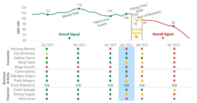
Source: BLS, Federal Reserve, Census Bureau, ISM, BEA, American Chemistry Council, American Trucking Association, Conference Board, and Bloomberg. The ClearBridge Recession Risk Dashboard was created in January 2016. References to the signals it would have sent in the years prior to January 2016 are based on how the underlying data was reflected in the component indicators at the time.
The dashboard was less healthy in 1973 before the oil price spike, despite the overall green signal. The shock from oil, combined with the aforementioned challenges, led to a rapid deterioration to an overall yellow signal and the beginning of the recession, before a drop to red in early 1974. In some ways this is similar to the rapid onset of COVID-19 in 2020, which caused a rapid deterioration of the dashboard and near instantaneous start of a recession, although the overall signal was already yellow and had been since mid-2019.
We are now two months into the current oil price spike. Despite some weakening, the overall dashboard signal remains green. While there are similarities to the experience of 1973, there are many more differences, the most crucial being a stronger starting economy. While further worsening in the dashboard is likely in coming months, recent data suggests an overall red signal is not in the cards.
To find out more, Investment Strategist Jeff Schulze analyzes the 1Q GDP shortfall, highlights continued strength in the jobs market and why the economy should be able to weather the current oil price spike. He also offers perspective on recent action by the Federal Reserve and how volatile equity markets may be nearing a tradable low.

Jeffrey Schulze, CFA

Josh Jamner, CFA
Related Perspectives
Anatomy of a Recession