Although markets often pause to digest after large gains, history suggests these episodes usually prove fleeting, meaning major indexes could move higher in the second half of 2026.
Anatomy of a Recession
The Long View: When Doves Cry
Key Takeaways
- While one widely followed yield curve has inverted, raising the “R” word, the three-month/10-year curve suggests near-term recession worries may be premature.
- The Fed’s narrative has pivoted in response to shifting data, with even the most notable doves on the FOMC changing their tune. When doves call out inflation as public enemy number one, investors are well served to take the Fed seriously.
- While the speed of the latest market recovery has taken many by surprise, it is consistent with history. More pronounced and longer-lasting drawdowns typically occur against a backdrop of declining earnings expectations, whereas selloffs driven by multiple contraction tend to be shorter-lived.
Not All Curves Are Created Equal
Over the last 15 months, the “R” word was blissfully absent in connection with the U.S. economy as 2021 experienced the strongest real GDP growth in over 35 years. However, the economy has been dealt two bad cards in recent months: spiking energy prices due to Russia’s invasion of Ukraine, and tighter Fed policy with the beginning of the rate hike cycle. There is little question that economic growth will slow in 2022, with current consensus of 2.6%, less than half the pace of last year’s 5.5% expansion. Yet, there is a difference between slowing growth that is normalizing from an extremely strong position and a recession.
The U.S. economy tends to be resilient in the face of exogenous shocks, but multiple shocks occurring simultaneously increase the odds of a recession. Amplifying these fears is the recent inversion of the yield curve, a harbinger of past recessions. Specifically, the inversion of the two-year/10-year (2Y/10Y) yield curve. All yield curves, however, are not created equally. We prefer the three-month/10-year (3M/10Y) yield curve for the ClearBridge Recession Risk Dashboard due to its better track record (with fewer false positives) and longer history, as the two-year U.S. Treasury was only introduced to the market in the mid-1970s. Crucially, the 3M/10Y curve remains rather steep (Exhibit 1). Although we expect it to flatten as more rate hikes occur, history suggests that near-term recession worries may be premature.
Exhibit 1: 3M/10Y Yield Curve Not Flashing Recession
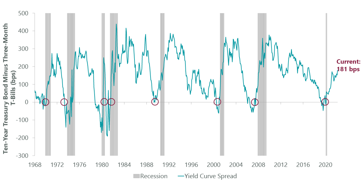
Data as of March 31, 2022. Source: FactSet.
The yield curve inversion itself doesn’t directly affect the economy. Rather, it’s typically a sign of overly tight monetary policy that has become restrictive enough to negatively impact economic growth, necessitating rate cuts to undo some of the damage. Put differently, an investor would only buy a longer-term (duration) bond at a lower yield if they expected short-term yields to drop, i.e. for the Fed to cut rates. This is partly why the 3M/10Y yield curve may more accurately depict when the Fed is approaching a policy error, as the 3M is more closely linked to the federal funds rate whereas the 2Y Treasury is pricing an estimate of Fed policy over a longer period that may or may not be the reality. Critically, the 3M/10Y remains at levels historically consistent with an above-average return environment.
Another common refrain is “every recession has been preceded by an oil spike.” As we know, correlation does not equal causation, meaning that just because on event has historically proceeded another does not mean the first event was the cause of the second. It is true that energy prices have spiked to levels consistent with shocks seen ahead of past recessions. However, the U.S. consumer is far more resilient to oil price shocks today compared to history. For example, median incomes are 26% higher today than the last time oil prices were nearly triple-digits (2011-2014) and average automobile fuel efficiency has improved by 7% according to the Department of Transportation, a topic explored in last month’s blog.
Perhaps even more importantly, the context around when an oil price shock occurs is crucial in terms of economic outcome. Going back to 1970, there have been the same number of examples of a 60%+ oil price shock leading to a recession as not (when multiple spikes in short periods of time are consolidated). In cross referencing these periods with the ClearBridge Recession Risk Dashboard (Exhibit 2), the starting position of the dashboard can prove to be an important clue as to the economy’s fate. Oil price shocks that occurred amid frail economic backdrops (majority red/yellow indicators and red overall signal) always progressed into recessions, whereas five out of six shocks that occurred amid stronger backdrops (majority green indicators and green overall signal) did not.
Exhibit 2: Dashboard Determines Economy’s Fate

Note: Oil price is Arabian Gulf Arab Light prior to April 1993, and West Texas Intermediate from April 1993 –present. Data as of Feb. 1, 2022, latest available as of March 31, 2022. Oil price sources: Bloomberg, Federal Reserve Bank of St. Louis, Economic Research Division, NYMEX. Recession Dashboard Sources: BLS, Federal Reserve, Census Bureau, ISM, BEA, American Chemistry Council, American Trucking Association, Conference Board, Bloomberg, S&P, NBER. The ClearBridge Recession Risk Dashboard was created in January 2016. References to the signals it would have sent in the years prior to January 2016 are based on how the underlying data was reflected in the component indicators at the time.
Given today’s healthy economy, with the majority of indicators and overall signal flashing green, we view the chances of the oil price shock tipping the economy into recession to be relatively low. This month there are no signal changes on the dashboard. While credit spreads widened substantially in early March, they narrowed in the back half of the month and remain in green territory.
Exhibit 3: ClearBridge Recession Risk Dashboard

Data as of March 31, 2022. Source: BLS, Federal Reserve, Census Bureau, ISM, BEA, American Chemistry Council, American Trucking Association, Conference Board, and Bloomberg. The ClearBridge Recession Risk Dashboard was created in January 2016. References to the signals it would have sent in the years prior to January 2016 are based on how the underlying data was reflected in the component indicators at the time.
A final worry is a less supportive Fed, with the rate hike cycle underway and balance sheet reduction (QT) likely in the coming months. The Fed has more than once sparked recession through overdone policy tightness. These fears are at the fore with the Fed fully focused on the inflation side of its dual mandate. Over the past few months, the Fed’s narrative has sharply pivoted in response to incoming data, with some of the most notable doves such as Neel Kashkari and Mary Daly changing their tune and advocating a greater emphasis on price stability. When doves cry, naming inflation public enemy number one, investors are well served to take the Fed seriously.
This brings up an important development market participants will have to grapple with for the rest of this cycle, that the so-called “Fed put” will likely be replaced by the “Fed call.” The situation today is appreciably different compared to the last cycle when inflation, economic growth, and unemployment were anemic. In that environment, any sustained pressure on financial markets could have easily pushed the economy into a recession, meaning that the Fed needed to keep financial conditions accommodative – hence, the Fed put.
The current environment doesn’t necessitate keeping the training wheels on, with above-trend economic growth, hot inflation, and a tight labor market. Last month, Fed Chair Jay Powell reiterated his view that monetary policy is transmitted via financial conditions, meaning a tighter policy stance to combat high inflation should also lead to wider credit spreads, higher interest rates and lower equity prices. Although the FOMC has turned decisively more hawkish with markets pricing in over nine hikes in 2022 (compared to only one hike six months ago), financial markets have recently rallied, somewhat loosening financial conditions (Exhibit 4), the opposite of what the Fed desires.
Exhibit 4: Financial Conditions

Data as of March 31, 2022. Source: Goldman Sachs and Bloomberg.
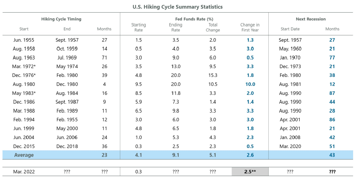
Consequently, the birth of the Fed call may be upon us wherein the Fed tries to cool the economy by adopting a more aggressive policy stance given low near-term recession risks. In contrast to tighter monetary conditions driving the Fed to back off in the past, the current environment may give way to not-tight-enough monetary conditions and further tightening in the coming months. This means that a market correction is unlikely to lead to a shift in Fed policy, as was the case in 2015 and 2018, as a moderate correction is likely to help the Fed achieve its aims in the current environment. Furthermore, if the market continues to rally, it could embolden the Fed to tighten even more aggressively, hence the Fed call. While nine-plus rate hikes in less than a year seems abrupt, from a historical perspective it is less jarring and in-line with the average first year seen in past tightening cycles as shown in Exhibit 5.
Exhibit 5: Is This Cycle Special?
*Rates shown for these dates are the rates as of the last hike within the first year and not the rate one year after the first hike of the cycle.**Change in first year Fed Funds rate implied by Fed Fund Futures. Data as of March 31, 2022. Source: Bloomberg.
Perhaps the key question for the sustainability of the economic recovery in the face of a more hawkish Fed, an oil price shock, and the yield curve inversion lies with the U.S. consumer. Sentiment is near extremely pessimistic levels, with the University of Michigan consumer sentiment survey substantially below the lows from the COVID-19 recession and only modestly better than the worst readings seen during the Global Financial Crisis (GFC). While this survey is known to have methodological issues, one-third of respondents expect their overall financial position to deteriorate in the year ahead.
Inflation appears to be the primary worry for most consumers rather than the health of the labor market, a shift relative to the past four decades. However, there is an important distinction between being worried and disliking higher prices and not being able to afford something, which would be far more concerning as a recession risk. Despite the fear, the U.S. consumer is arguably in the best financial shape of their lives with robust compensation gains and healthy balance sheets.
Up until COVID-19, every recent Fed tightening cycle had kicked off with U.S. consumers being more indebted than at the start of the prior hike cycle. This is no longer true, with aggregate consumer debt amounting to just 77% of GDP, well below the 100% seen in 2008. Household net worth jumped by $5.3 trillion in just the fourth quarter of 2021, bringing the full-year increase to $18.9 trillion or 14% YoY. To put this in perspective, a $1 increase in the price of gasoline for a full year costs households an estimated $140 billion or less than 1% of last year’s increase in household net worth, according to Bank of America. While not every household participated equally in the increase in net worth, data suggests that even the lower deciles have seen an increase which should help buffer the drag from higher prices.
Furthermore, households are willing to use the cash they accumulated during the pandemic to sustain spending. The saving rate declined to 6.1% in January, the lowest since 2013. Accumulated savings will be a key shock absorber and, with a positive savings rate, aggregate consumers are still saving even in the face of higher inflation (Exhibit 6). Given these dynamics, for potentially the first time in history, consumers are experiencing an “irrational lack of exuberance” given the wealth accumulation and wage gains seen in the post-pandemic era.
Exhibit 6: Personal Savings Rate
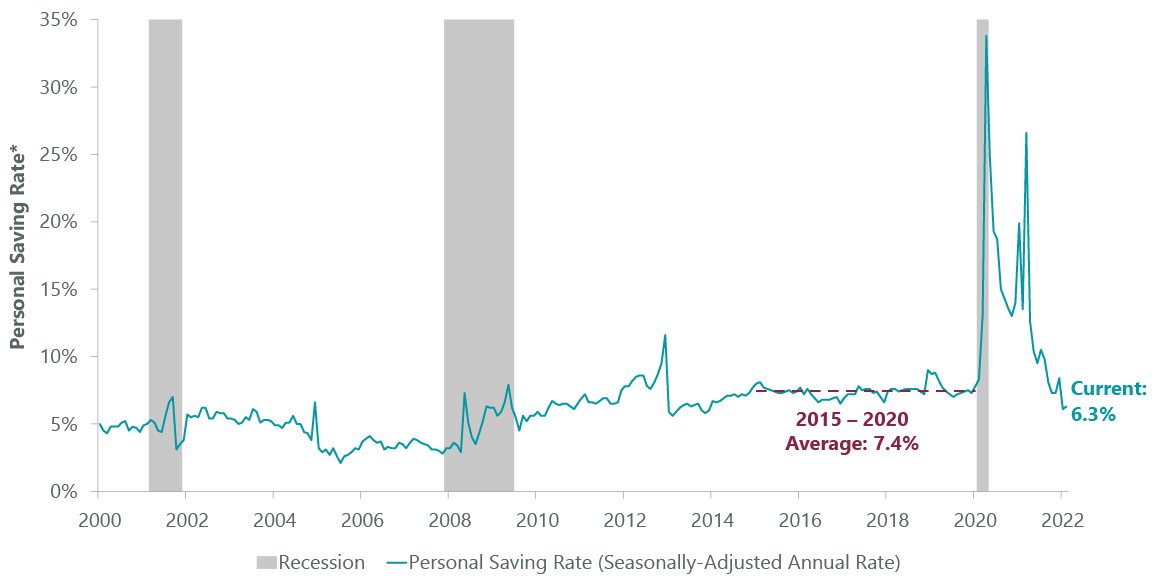
*Personal saving as a percentage of disposable personal income (DPI), frequently referred to as the “personal saving rate,” is calculated as the ratio of personal saving to DPI. Personal saving is equal to personal income less personal outlays and personal taxes. Data as of Jan. 31, 2022. Source: U.S. Bureau of Economic Analysis, Federal Reserve Bank of St. Louis.
The current backdrop is very different than past cycles and provides reason for optimism regarding the resilience of the economy in the face of multiple shocks. While there is less of a buffer against additional shocks, the cushion provided by healthy consumers and businesses should allow this expansion to extend further. We continue to believe that 2022 will be The Year of Transition with the shifting policy and earnings landscape leading to a more volatile equity market than in the early stages of the economic recovery. This began to play out in the first quarter, amplified by the Russian invasion of Ukraine. The subsequent speed of the market recovery has taken many by surprise but may be consistent with history.
More pronounced and longer-lasting drawdowns typically occur against a backdrop of declining earnings expectations, whereas selloffs driven solely by multiple contraction tend to be shorter-lived (Exhibit 7). S&P 500 Index earnings have remained resilient against the macro and geopolitical headwinds experienced so far, helping to support the market. The sustainability of this dynamic should ultimately dictate the duration and magnitude of the current drawdown, along with the timeframe for a full recovery back to the prior highs.
Exhibit 7: EPS vs. P/E Selloffs
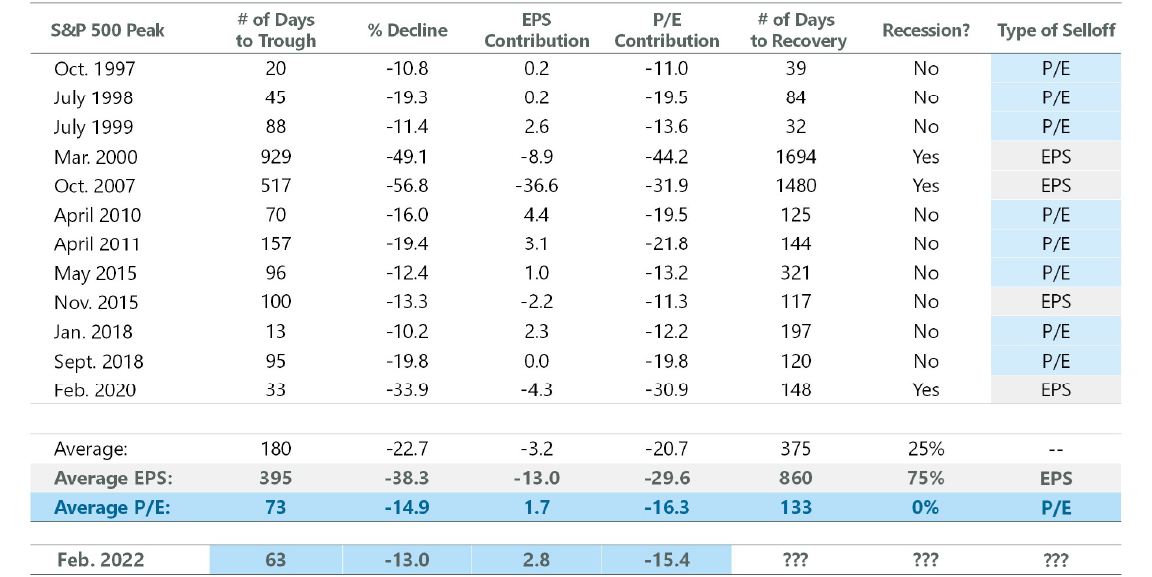
Note: EPS and P/E contribution does not add to % decline; contribution math is multiplicative. Source: NBER, S&P, FactSet.
While bulls may feel vindicated after the last three weeks, the market may need some additional time to digest the robust gains from the March 2020 lows, and the period of choppiness may not yet be over. The current bull market celebrated its second birthday last month and its returns from the recessionary lows have been truly special. Compared with all rolling two-year periods going back to 1950, the current stretch is the best two-year run the market has seen over the timeframe (Exhibit 8). However, history suggests that on the heels of a strong two-year rally, the third year tends to see a period of consolidation and more modest gains.
Exhibit 8: Time to Digest Early Gains
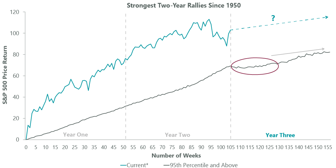
*Data shown from March 23, 2020 through March 23, 2022. Data as of March 31, 2022. Source: FactSet, S&P Global.
Although it’s possible the lows for this year are already in, history suggests that it may take another few rangebound quarters before the market resumes its upward momentum. As with all mid-cycle transitions, this digestion period should ultimately provide fuel for the market to rally into the later stages of economic expansion.

Jeffrey Schulze, CFA
Related Perspectives
Anatomy of a Recession