Given our constructive economic and market outlook, we believe the market will ultimately climb today’s wall of worry higher as several of investors’ leading fears are assuaged.
Anatomy of a Recession
AOR Update: Recession or Vibecession?
Key Takeaways
-
The degree to which a recent plunge in “soft” survey data, which typically occurs during recessions, translates into weakness in actual “hard” data in the coming months will be crucial in determining the health of the economy.
-
The risk-reward tradeoff facing the economy and financial markets skews unfavourably in our view, although a positive change in trade policy or a renewed focus from the administration on its supply-side agenda (deregulation, tax cuts/fiscal support) could drive a favourable shift.
-
The overall dashboard reading remains in expansionary green territory, although it is too early for the data to reflect the impacts from higher tariffs. Profit Margins worsened to a cautionary yellow signal this month.
It is often said that March “comes in like a lion, out like a lamb.” This references the transition from winter to spring weather, but it is perhaps more applicable to what equity markets experienced in April this year. U.S. equities fell precipitously in the week following President Trump’s “Liberation Day” tariff announcements, with the S&P 500 Index sliding by -11% and the VIX spiking above 50. This brought equities to the precipice of bear market territory, down -19% from the February 19 peak. However, stocks rallied back later in the month amid signs of tariff de-escalation. Remarkably, the S&P 500 ended down “just” -0.8% for the month.
Survey data was already showing meaningful signs of deterioration during the first quarter of 2025, a trend that accelerated in April. For example, the Conference Board’s Consumer Confidence survey had already dropped by -18.9 points from its November post-election peak through March, before April’s -7.9 decline brought the measure back to the 2020 pandemic lows. Deteriorations like this typically only occur during recessions, meaning the degree to which weaker “soft” survey measures translate into actual “hard” data in the coming months will be crucial in determining the health of the U.S. economy (Exhibit 1).
There is some debate about whether the hard data will ultimately follow the soft data, however. This primarily stems from what occurred in 2022, when soft data weakened precipitously in the wake of the Russian invasion of Ukraine, the regional bank crisis and elevated inflation, while the hard data largely held up. This period came to be known as the “vibecession.” Even though many Americans didn’t feel great about the health of the economy, their continued strength on the back of a healthy labour market, prior fiscal support and residual pandemic savings powered the economy forward.
Exhibit 1: Hard vs. Soft Data
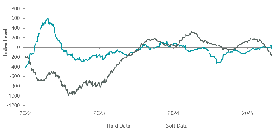
Note: Citi U.S. Soft and Hard Economic Data Change Indices. As of 30 April 2025. Source: Citi.
In 2025, the probability of consumer strength overpowering trade-related headwinds appears lower, in our view. While the labour market remains healthy with monthly job creation averaging 144k so far in 2025, this pales in comparison to the red-hot labour market of 2022 when monthly job creation averaged 380k (and 603k in 2021). Further cooling in the labour market could prove problematic for the economy given the fact that labour income represents the majority of spending power for most Americans. Importantly, consumers appear to have already begun to retrench in the face of elevated uncertainty, as highlighted by Chipotle CEO Scott Boatwright during the burrito chain’s first-quarter earnings call:
“Saving money because of concerns around the economy was the overwhelming reason consumers were reducing the frequency of restaurant visits.”
Dashboard Remains Green, but Beware of 1970s Echoes
Last month, we noted that the dashboard did not yet reflect the impacts from tariff announcements, similar to what happened at the start of the pandemic. This dynamic was also present in the dashboard with the oil embargo of the 1970s, another period where exogenous shocks ultimately led to a recession.
In fact, several elements of the 1973–75 recession rhyme with the current environment. We wrote about this period in more detail a few years ago, but to quickly recap: an expansion in fiscal spending in the mid-1960s — to finance the Vietnam War and the Great Society social welfare programs — helped to push up inflation. This was compounded by loose monetary policy, which led foreign investors to question the sustainability of the gold standard. A run on the dollar was followed by the move off the gold standard, along with wage and price controls, and eventually an oil crisis.
There are key differences between that period and today as well, such as: the U.S. is no longer on the gold standard, today’s demographic backdrop suggests less inflation risk and the development of the U.S. shale industry has provided an offset (economically) to the negative impacts of higher oil prices.
Interestingly, however, while soft data (ISM New Orders) and hard data (Retail Sales, Profit Margins) began to worsen on the dashboard as the energy shock unfolded in the mid-1970s, it was the soft data deteriorating to red first, while the hard data held up in yellow territory, initially.
Exhibit 2: 1973-1975 Recession Dashboard Evolution
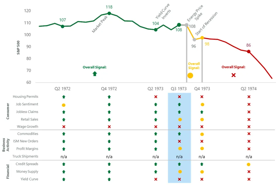
Source: BLS, Federal Reserve, Census Bureau, ISM, BEA, American Chemistry Council, American Trucking Association, Conference Board, and Bloomberg. The ClearBridge Recession Risk Dashboard was created in January 2016. References to the signals it would have sent in the years prior to January 2016 are based on how the underlying data was reflected in the component indicators at the time.
Some elements of the current environment rhyme with this historical period. For example, ISM New Orders have quickly deteriorated over the past few months as the trade war has escalated. While it is too soon for hard data indicators to show trade-related weakness, at least one — Profit Margins — appears to have been seeing headwinds even before Liberation Day. This indicator worsened to a cautionary yellow signal this month. The overall dashboard reading remains in expansionary green territory, and there are no other changes to the dashboard this month (Exhibit 3).
The deterioration in Profit Margins reflects events that unfolded prior to the escalation of the trade war. Inflation, and thus the pricing power of corporations, has cooled more rapidly than wages and other key input costs, crimping profits. This has driven profit margins down from record levels, which is driving the signal change to yellow. In the absence of a trade war, this dynamic would be less concerning. However, the prospect of additional strain on margins in the coming months from higher tariffs appears likely. This is worrying because as margins contract and profits erode, corporate management teams are often eventually forced to lay off workers, starting or amplifying a recessionary feedback loop as consumers pull back given the loss of income.
Exhibit 3: U.S. Recession Risk Indicators
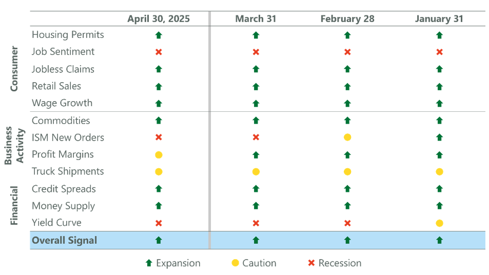
Data as of 30 April 2025. Sources: BLS, Federal Reserve, Census Bureau, ISM, BEA, American Chemistry Council, American Trucking Association, Conference Board, Bloomberg, CME, FactSet and Macrobond. The ClearBridge Recession Risk Dashboard was created in January 2016. References to the signals it would have sent in the years prior to January 2016 are based on how the underlying data was reflected in the component indicators at the time.
Given this, we continue to believe that Initial Jobless Claims are the single most important economic indicator to watch — our canary in the coalmine — in determining the path of the economy. So far, claims have held up extremely well in the weeks following Liberation Day, and we believe the late-April jump is a seasonal adjustment issue related to the timing of spring break in New York that has cropped up over the past few years but will likely reverse in early May. However, slipping profit margins means there is less of a buffer should the labour market weaken or demand slow in the coming months.
This leads us to believe that the risk-reward tradeoff facing both the economy and financial markets skews to the downside at present. A positive change in trade policy or a renewed focus from the administration on its supply-side agenda (deregulation, tax cuts/fiscal support) could shift the skew to be more favourable. However, prompt action is likely needed in order to counteract the negative (and building) effects of elevated uncertainty and margin pressure.
As a result, we believe that a focus on higher-quality companies with proven track records managing through periods of turmoil — such as dividend growers — should continue to benefit investors. Notably, companies that have been able to consistently raise their dividends recently closed one of the largest 12-month performance gaps witnessed in the last 30 years relative to the S&P 500. Following similar periods of underperformance in the late 1990s and early 2020s, dividend growers then went on to outperform the S&P 500 in subsequent years.
Exhibit 4: Dividend Growers Gaining
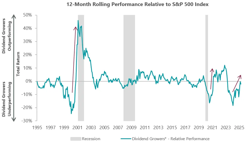
*Dividend Growers are S&P 500 stocks with three consecutive trailing years of positive dividend growth (inclusive of special dividends) on a rolling basis (quarterly), evaluated monthly, equal weighted. Data as of 31 March 2025. Sources: S&P, NBER, Bloomberg.

Jeffrey Schulze, CFA

Josh Jamner, CFA
Related Perspectives
Anatomy of a Recession