Although markets often pause to digest after large gains, history suggests these episodes usually prove fleeting, meaning major indexes could move higher in the second half of 2026.
Anatomy of a Recession
AOR Update: Home Sick
Key Takeaways
- Although the Federal Reserve’s rapid move toward tightening has caused market volatility to spike to start the year, these selloffs are not unusual and have historically presented buying opportunities for long-term investors.
- Recession risks remain low and with the jobless rate recently dropping below the Fed’s estimate of long-run unemployment, half of its dual mandate is nearly satisfied, meaning the central bank can be more aggressive in managing inflation.
- While fed funds futures are pricing in four rate hikes in 2022, we believe how sick workers are measured in employment data could be understating jobs and overstating wage gains. This, in turn, impacts monetary policy expectations and could lead to a more dovish rate hike cycle than currently forecast.
Risks of Tightening Send Volatility to Highest Level in Two Years
It may only be February, but it seems safe to say that 2022 is shaping up to be a very different experience than what investors enjoyed in 2021. For starters, the S&P 500 Index has already eclipsed last year’s largest drawdown with the benchmark experiencing its seventh-worst January since 1950. Furthermore, U.S. equities have endured the highest volatility since March 2020 with the S&P 500 narrowly avoiding entering correction (-10%) territory and the Nasdaq nearing bear market territory (-20%). With inflation elevated and growth slowing from high levels, investors have become focused on the prospect of monetary policy tightening. At last week’s Federal Open Market Committee meeting, Chairman Jay Powell made it clear that rate hikes were likely to begin at the March meeting, and futures markets are now pricing 1.2 hikes at that meeting and 4.9 total by year-end.
To put recent tightening in perspective, in mid-September fed fund futures were not even pricing a full rate hike in all of 2022, which means more than four hikes have already been priced in over the last four months. While this is a fairly large move in a short period, equity market volatility historically spikes around Fed liftoffs, a dynamic discussed in last month’s Long View. The silver lining is that these selloffs have usually presented buying opportunities for long-term investors with positive returns on average in the 6-, 12-, and 18 months following the start of the last four rate-hike cycles.
Several changes have occurred in the economy that have led the Fed to the doorstep of a tightening cycle. The Fed aims to fulfill its mandate of attaining “maximum employment,” stable prices and moderate long-term interest rates by applying the appropriate monetary policy. In practice, if maximum employment and stable prices (2% inflation) are achieved, interest rates should remain moderate, which is why the term “dual mandate” is commonly used and not a “triple mandate.” With the unemployment rate officially dropping below the Fed’s estimate of long-run unemployment in December, the maximum employment half of the mandate is nearly satisfied. This means the Fed can be more aggressive in bringing inflation down toward more desirable levels. Another change is that wages have accelerated, as the Wage Growth indicator on the ClearBridge Recession Risk Dashboard turned from yellow to red in December. This is the first indicator to turn red this cycle and historically has been the longest-leading indicator on the dashboard, turning yellow nearly two years and red over 1.5 years before recessions. There are no changes on the dashboard this month, and recession risks continue to remain low.
Exhibit 1: ClearBridge Recession Risk Dashboard
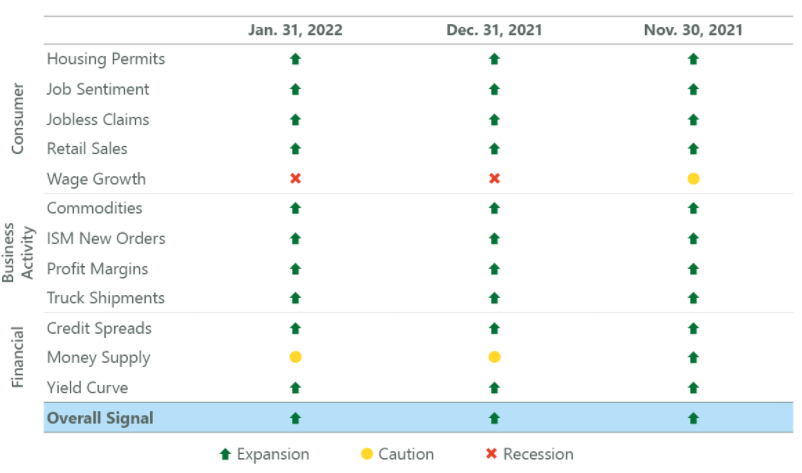
Source: ClearBridge Investments
While wage gains have been elevated, labor market data remains distorted due to the COVID-19 pandemic. Specifically, the Bureau of Labor Statistics (BLS) continues to highlight that data collection remains a challenge. Although more pronounced in the early part of the pandemic, it appears that issues remain, particularly when measuring hourly workers. Specifically, hourly workers may not show up on company payrolls if they are home sick, whereas salaried workers do. During a spike in cases requiring workers to remain home and quarantine, this can distort jobs and wage figures.
Supporting evidence for this dynamic comes from the difference between the household survey and the establishment survey within the jobs report. Each month, the BLS conducts two surveys –one reaching out to individuals (household survey) and the other corporations (establishment survey). The former is used to calculate the unemployment rate (since they need to know how many people are not working) and the latter is used for payroll gains and wages (since corporations hire and provide compensation for most American workers).
Exhibit 2: Two Surveys, One Report
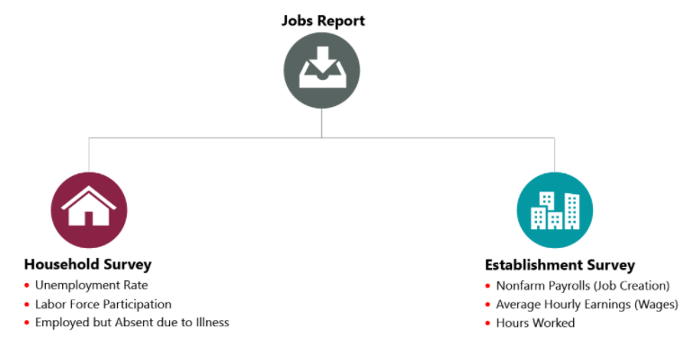
Source: BLS.
However, within the household survey, there is a sub-category for individuals who are employed but absent from work due to illness or injury. Typically, this data reflects seasonality, with more workers calling-in sick during winter months. Outside of a global pandemic, the regular seasonal-adjustment process effectively removes the influences of these patterns to reveal real employment change from month-to-month. However, the number of workers reporting they are employed but not at work due to sickness has been elevated throughout the pandemic relative to the pre-pandemic average for any given month. In other words, the two surveys are generally in sync when it comes to accounting for sickness, but the pandemic has thrown a wrench into the data.
The difference between the number of sick workers presently and the typical amount for the same month over the decade prior to the pandemic, which we term “excess sick workers,” is one way of analysing the impact of the pandemic on the labor market. The number of excess sick workers has ebbed and flowed through the pandemic, increasing during the Omicron and Delta waves and declining when case counts fell during the spring and early summer of 2021. Importantly, the number of excess sick workers has had a strong relationship with payroll gains, supporting the notion that there continue to be pandemic-related measurement issues impacting the establishment survey, and thus the nonfarm payroll number and wage gains derived from it.
Exhibit 3: Pandemic Still Impacting the Labor Market
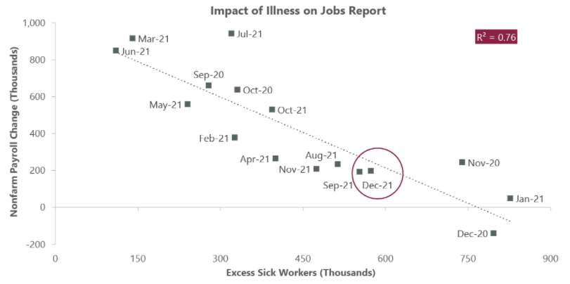
Data as of Dec. 31, 2021. Source: BLS and Bloomberg. Note: Excess sick workers is the difference in current population survey “Employed – With a job, not at work, Own Illness” absences, vs. the 2010-2019 average of “Employed – With a job, not at work, Own Illness” absences, by month.
Although the relationship with wages is not as strong as with payroll gains, it’s still significant and suggests about 20% of the change in wages in a given month can be explained by the excess sick worker measure. This likely is the result of how average hourly earnings are calculated, which is total wages divided by total hours worked. If hourly workers – who are typically lower paid – are being even modestly undercounted, it disproportionately impacts hours worked relative to wages paid and will push average hourly wages mechanically higher. This dynamic was evident in the April 2020 jobs report, which saw 20.5 million jobs disappear coupled with a surprising +4.6% month-over-month spike in wages due to the substantially larger share of lower-paying jobs lost. These types of occurrences are in part why the Fed has tried to focus on alternate wage measures, such as the Employment Cost Index and the Atlanta Fed’s Wage Growth Tracker, which are less susceptible to these issues given their methodology. To be clear, these metrics also currently show elevated, albeit less wage pressure.
All of this influences our perception of labor market health, which in turn impacts expectations for what constitutes appropriate monetary policy and the Fed’s decisions around rate hikes. If jobs are being undercounted and wages overstated, there may be less impetus for the Fed to hike as aggressively (relative to current market expectations). This dynamic will likely only become clear as the country enters the virus’s endemic phase, hopefully over the course of the coming quarters. It could also potentially lead to the dashboard’s Wage Growth indicator turning back to yellow, which would be a first-time occurrence during an ongoing expansion. It could be that the impact of these distortions is smaller than we believe or even non-existent; simply a quirk in the data emerging from a small sample during a noisy period. Regardless, we will be monitoring it in the months ahead, and is one of several reasons why we hold the view that health of the labor market may be more robust than generally believed. If true, the surprise from the Fed in 2022 may turn out to be a dovish, rather than hawkish, second half of this “year of transition.”

Jeffrey Schulze, CFA

Josh Jamner, CFA
Related Perspectives
Anatomy of a Recession