Positive forces from One Big Beautiful Bill Act passage and future interest rate cuts should soon outweigh negative forces of tariff actions.
Anatomy of a Recession
The Long View: Follow the Herd?
Key Takeaways
- With a durable economic bottom in place, investor focus has already swung toward gauging the next recession, leading us to re-introduce the ClearBridge Recession Risk Dashboard. Its overall green signal gives us confidence the economy can weather a winter soft patch.
- Consumer spending of stockpiled cash, combined with a business inventory restocking cycle as COVID-19 restrictions ease, should lead to a pickup in economic activity in 2021.
- The lack of long-term recessionary scarring, better demographics and easier Fed policy should help drive a quicker economic recovery relative to the Global Financial Crisis, supporting further upside for equities.
Higher Multiples Not Uncommon Early in Expansion
In nature, animals learn that in order to survive there are times to follow the herd and there are times to stray away. Investors must also learn this lesson; at times it can be beneficial to follow a larger group and during others it can make sense to chart one’s own course. In the early and middle stages of an economic expansion, running with the herd can be a beneficial and safe proposition. As the recovery unfolds, some investors may be tempted to break off, worried about the formation of a bubble. With the S&P 500 Index currently trading at 22.5x forward earnings, many are concerned that the market may be overheating.
Importantly, an increase in equity multiples is not uncommon during the early stages of an economic expansion. Following recessionary troughs, market returns tend to be driven by P/E multiples during the initial market rally (approximately nine months) as investors anticipate an eventual earnings rebound. As the recovery matures over the subsequent two years, the opposite dynamic occurs, with multiple compression on the back of stronger earnings growth. Put differently, earnings typically contribute over 100% toward stock returns during this second phase of the rally and declining P/Es become a modest drag on returns (Exhibit 1). As we move through 2021 and eventually into 2022, we expect this same pattern to unfold; however, multiples may remain elevated relative to history for several reasons we discussed last month.
Exhibit 1: Multiples vs. Earnings
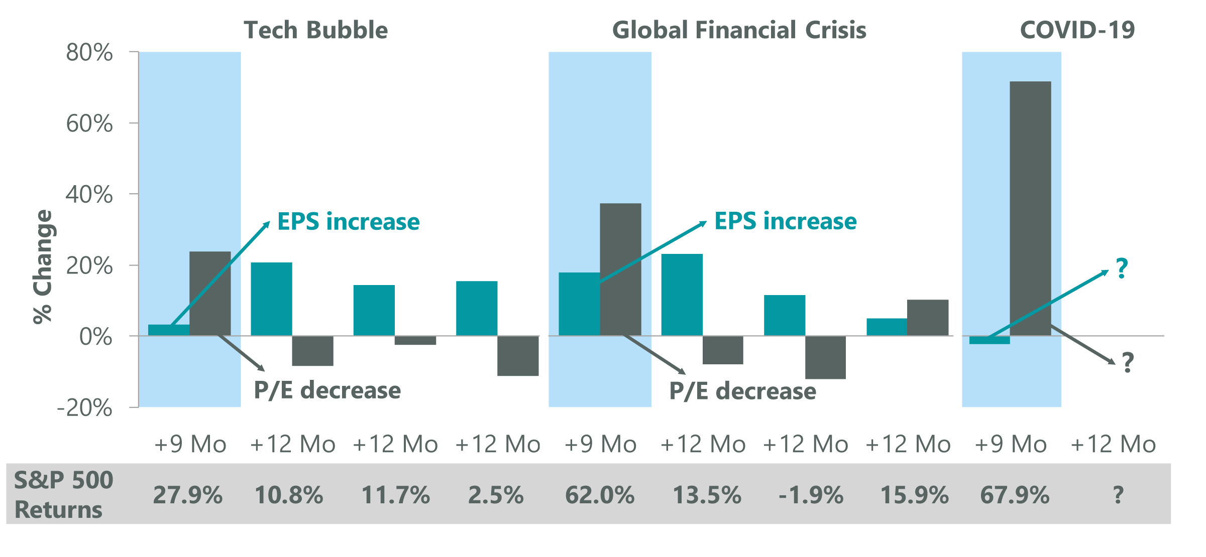
Data as of Dec. 31, 2020. Source: JP Morgan.
Valuations are currently elevated in part because investors correctly sniffed out the budding economic recovery. Unprecedented stimulus actions (both monetary and fiscal) short-circuited the typical bottoming process, as policymakers formulated a response that rapidly ended the economic crisis and fueled an upturn in financial markets. The scope of this improvement has been tracked throughout by the ClearBridge Recovery Dashboard, which has been emanating an overall expansionary green signal since the end of the second quarter. The overall dashboard continues to show strength beneath the surface, and there were no indicator changes in December. In our view, it has become clear that a durable economic and market bottom has formed, with the S&P 500 up 67.9% from the lows and a third-quarter GDP rebound of +33.4%. As such, this will be the last quarter we will be providing updates for the ClearBridge Recovery Dashboard.
Exhibit 2: ClearBridge Recovery Dashboard
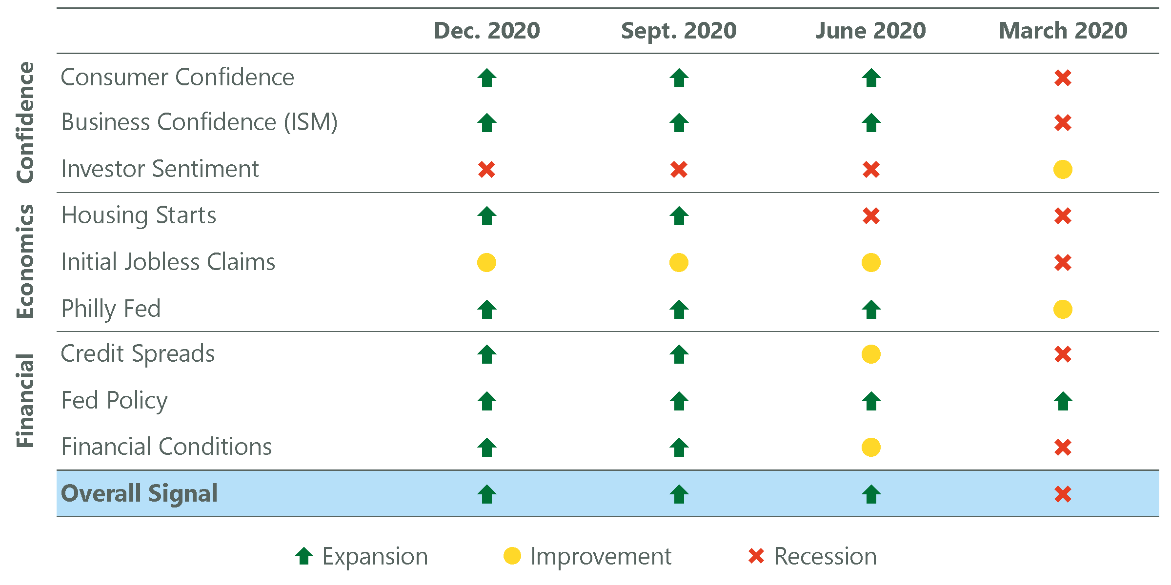
Data as of Dec. 31, 2020. Source: FactSet, Bloomberg, Conference Board, Census Bureau, Federal Reserve, FRBPA, Chicago Fed, ISM, Dept. of Labor, Bloomberg/Barclays, AAII, Investors Intelligence, and Moody’s.
Re-introducing Recession Risk Dashboard
With the end of the last downturn less in question, investor focus has already begun to swing toward the beginning of the next recession with some fearing a double dip in 2021. Economic growth appears to be slowing in the U.S. as an increase in the spread of COVID-19 has led to tighter social distancing restrictions and economic retrenchment. This soft patch is evident in data such as initial jobless claims, which have stumbled in recent weeks following the weakest payroll gains of the recovery in November. Accordingly, we are re-introducing the ClearBridge Recession Risk Dashboard, which we believe is most appropriate to focus on as we move through 2021.
The Recession Risk Dashboard is a group of 12 indicators that examine the health of the U.S. economy and the likelihood of a downturn. The dashboard monitors data points across three economic fault lines for recessionary tremors: Consumer Health, Business Activity and Financial Stress. At present, the overall signal is flashing a green expansion signal, as are seven of the 12 underlying indicators. Of the remaining five indicators, three are yellow and two are red. Perhaps unsurprisingly, all three Financial Stress indicators are currently green, with the Goldman Sachs Financial Conditions Index at its most supportive level on record. Given the dashboard’s overall green signal and continued improvement beneath the surface, we believe the current soft patch is just that, and that the U.S. economy should be able to weather the COVID-19 winter storm.
Exhibit 3: ClearBridge Recession Risk Dashboard
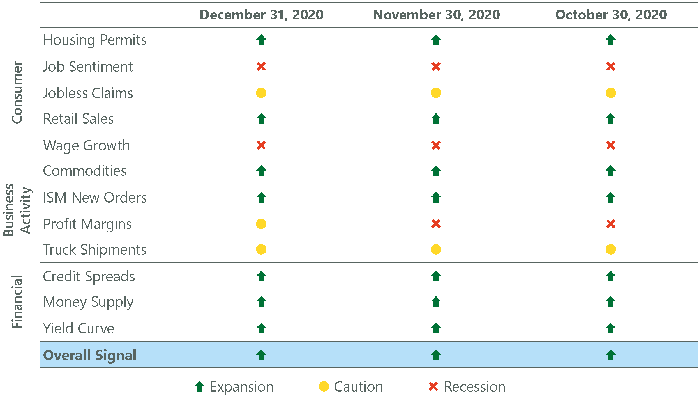
Data as of December 31, 2020. Source: BLS, Federal Reserve, Census Bureau, ISM, BEA, American Chemistry Council, American Trucking Association,Conference Board, and Bloomberg. The ClearBridge Recession Risk Dashboard was created in January 2016. References to the sign als it would have sent in the years prior to January 2016 are based on how the underlying data was reflected in the component indicators at the time.
Stimulus Fuels Upside in 2021
Further bolstering this view is the recently passed stimulus package, which will deliver $900 billion in support with a focus on consumers, small businesses and vaccine distribution. This spending is largely front-loaded and is equivalent to 4% of pre-COVID GDP. This should help drive low- and middle-income spending in the beginning of 2021, while higher-income spending should come back in the latter half of the year as social distancing measures are eased and discretionary spending on things like vacations and dining out recover. Ultimately, the stimulus bill is an enhancement to already strong 2021 growth prospects, as outlined in last quarter’s Long View. In fact, 2021 is expected to see the strongest GDP growth since 2000 (Exhibit 4). This is not just a one-time bounce back from the depths of the severe slowdown in 2020 either, as 2022 growth is expected to be as good as in any year since 2004.
Exhibit 4: Best Growth in Years
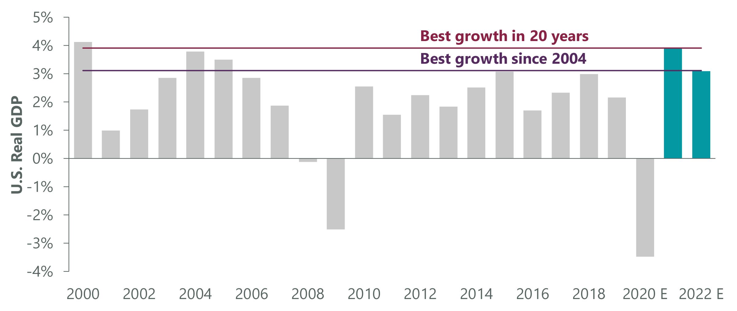
Data as of Nov. 30, 2020, latest available as of Dec. 30, 2020. Source: BEA, FactSet.
Stimulus aside, there are several reasons for the expected pickup in economic activity. First, consumers have saved over $1 trillion during the pandemic due to the combination of government transfer payments and the inability to spend. These funds will likely be drawn down over the course of 2021, particularly as the ability to spend resumes when herd immunity is reached and social distancing measures are eased. A second driver could come from a substantial inventory restocking cycle with U.S. inventories at 2014 levels (Exhibit 5). As visibility is restored and business confidence continues to recover, companies will likely prepare for a return to more normal conditions. In order to avoid supply constraints, they will need to restock depleted inventories, which should lift the economy. Similar to consumers, corporations also fortified their balance sheets during the pandemic with a buildup of approximately $500 billion in excess cash among S&P 500 companies. This capital is likely to be deployed into things like building inventory levels and capex as demand increases, as well as dividends and buybacks.
Exhibit 5: Inventory Re-stock
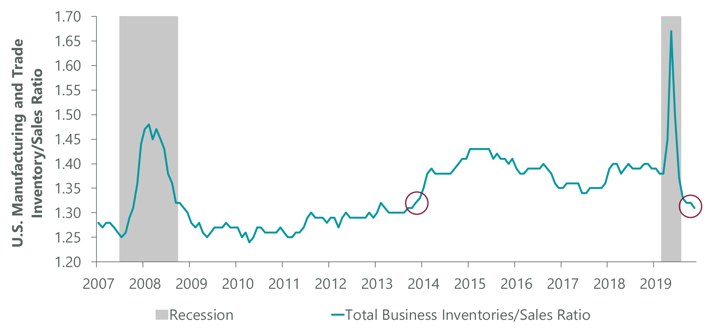
Data as of Oct. 30, 2020. Source: U.S. Census Bureau, FactSet.
Not the GFC: Different Recession, Different Recovery
Although no two economic cycles are the same, they often rhyme. Many investors remain on guard against a repeat of the 2007-2009 crisis and are using the last recovery as the blueprint for 2021, perhaps in part due to recency bias. This is a cognitive behavior where an individual places greater emphasis on recent events instead of historical ones. However, the COVID-19 shock was fundamentally different from the Global Financial Crisis (GFC) for several reasons. First, the latest recession was caused by an exogenous shock as opposed to an inherent economic problem. Put differently, the economy was fine up until the lockdowns occurred, whereas the GFC was caused by a set of issues that needed to be dealt with in the aftermath of the crisis, including an overheated housing market and bank leverage concerns. This should allow the current recovery to be quicker (economically speaking) as there are few pre-existing issues that need to be resolved, resulting in less of a drag on the economy.
Second, the policy response in 2020 was more effective in limiting structural damage to the economy. It took much longer during the GFC to deliver the appropriate policy prescription, resulting in deeper and longer-lasting scarring. Importantly, household balance sheets are in much better shape today relative to the last crisis with home prices rising, financial markets performing well, supportive fiscal stimulus and a decline in spending.
This lack of trauma is evident across many facets of the economy, including the labor market. One of the best real-time indicators of labor market health is job openings. While not included in the ClearBridge Recession Risk Dashboard given its somewhat limited history, it is an important metric we watch. In the aftermath of the GFC, it took five years for job openings to recovery to pre-recessionary levels. Today, job openings have already recovered to pre-crisis levels in under a year (Exhibit 6). This suggests a return to full employment can occur more quickly and should support a higher baseline level of economic growth in the coming years. This dynamic is consistent with the data from the National Federation of Independent Business (NFIB) Small Business survey focusing specifically on hiring plans, which has similarly recovered.
Exhibit 6: Labor Market Recovery
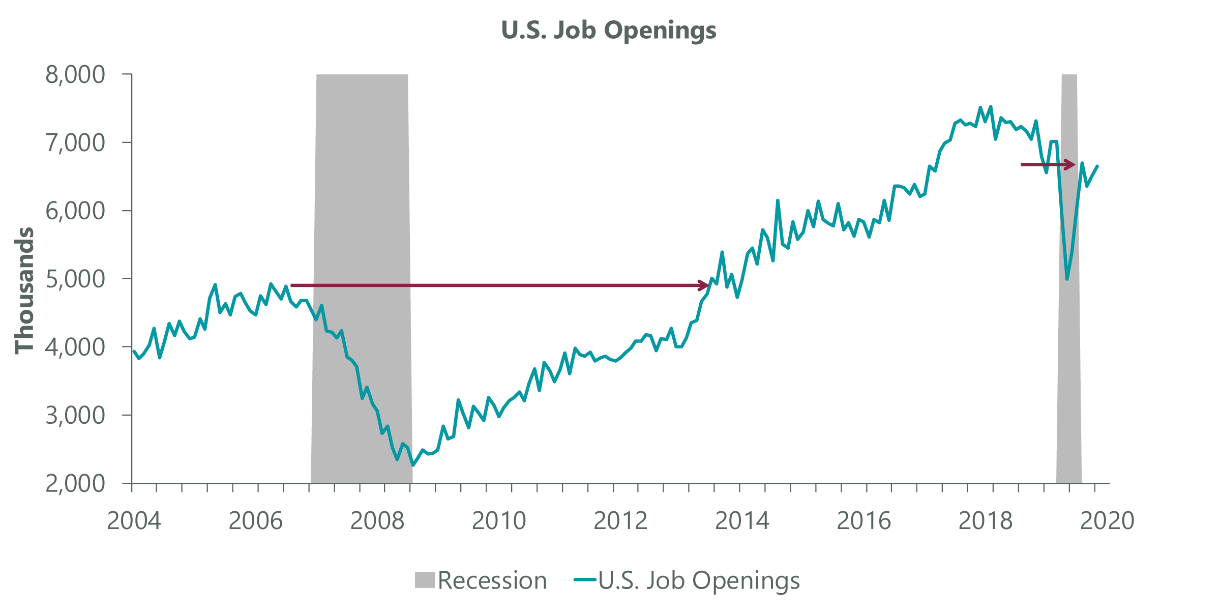
Data as of Nov. 30, 2020. Source: DOL, FactSet.
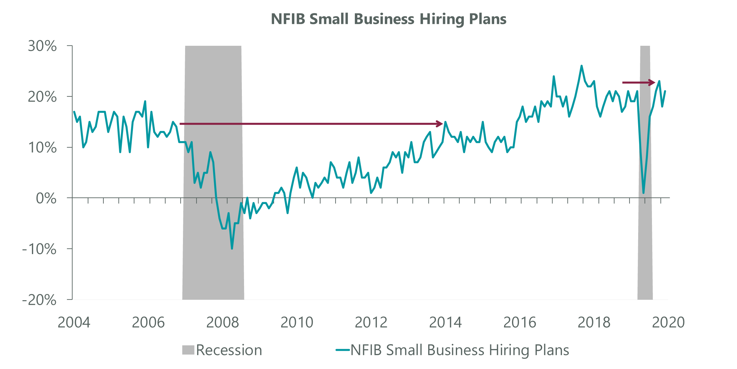
Data as of Nov. 30, 2020. Source: FactSet, NFIB.
Structurally, longer-term drivers of economic growth such as demographics are also dissimilar to the GFC. In 2009, the economy was facing a headwind as the oldest Baby Boomers began to exit the labor force in record numbers (Exhibit 7). This was exacerbated by the younger Boomers exiting their prime spending and earning years (35-54) and moving into the tail end of their careers. Behind them came the smaller Generation X cohort, meaning there were simply fewer people at peak economically productive age during the last decade. We believe this was one of the more underappreciated reasons for the lackluster economic growth seen in the last cycle.
Exhibit 7: 2009 Demographics
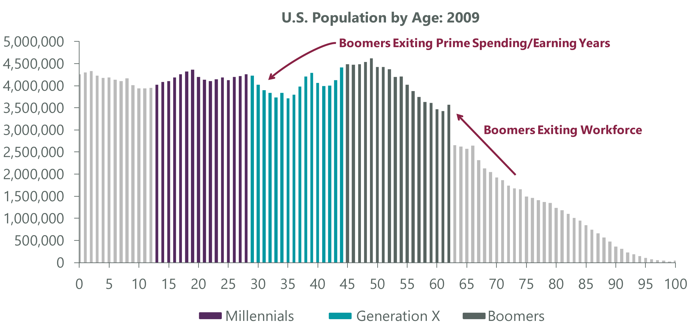
Source: U.S. Census Bureau.
The good news is the next decade will enjoy a demographic dividend similar to the one experienced in the mid-1990s. The Millennial cohort is much larger than Gen X and is just entering its prime spending and earning years (Exhibit 8). Although this positive impulse will be somewhat dampened relative to the mid-1990s due to the larger cohort of retirees, it should be an overall tailwind for GDP as we move through the next decade.
Exhibit 8: 2019 vs. 1994 Demographics
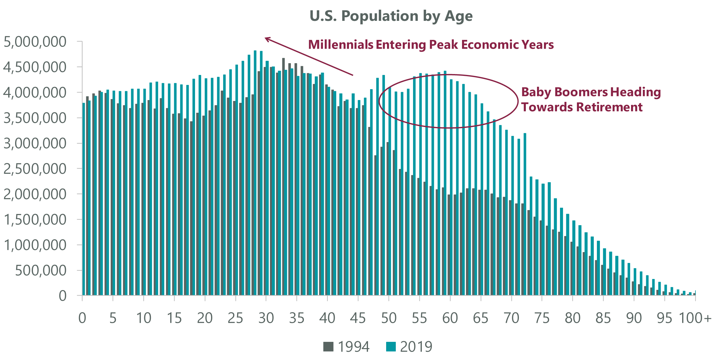
Source: U.S. Census Bureau.
The Fed Is Fighting the Last War
Whether the result of current conditions related to the nature of the recession or longer-term structural forces, we believe it is a mistake to apply last cycle’s slow growth playbook to the current recovery. In fact, there appear to be more differences than similarities in our view. However, there is one important institution that continues to be laser-focused on fighting the last war: the Federal Reserve. Last summer, the Fed introduced a new “average inflation target” regime that allows it to make up for past inflation shortfalls relative to its 2% goal (Exhibit 9). The result is a higher hurdle for the Fed to raise rates, and the latest “dot plots” show that the FOMC members do not expect the initial rate hike to come until 2024 at the earliest.
Exhibit 9: Fed’s New Framework
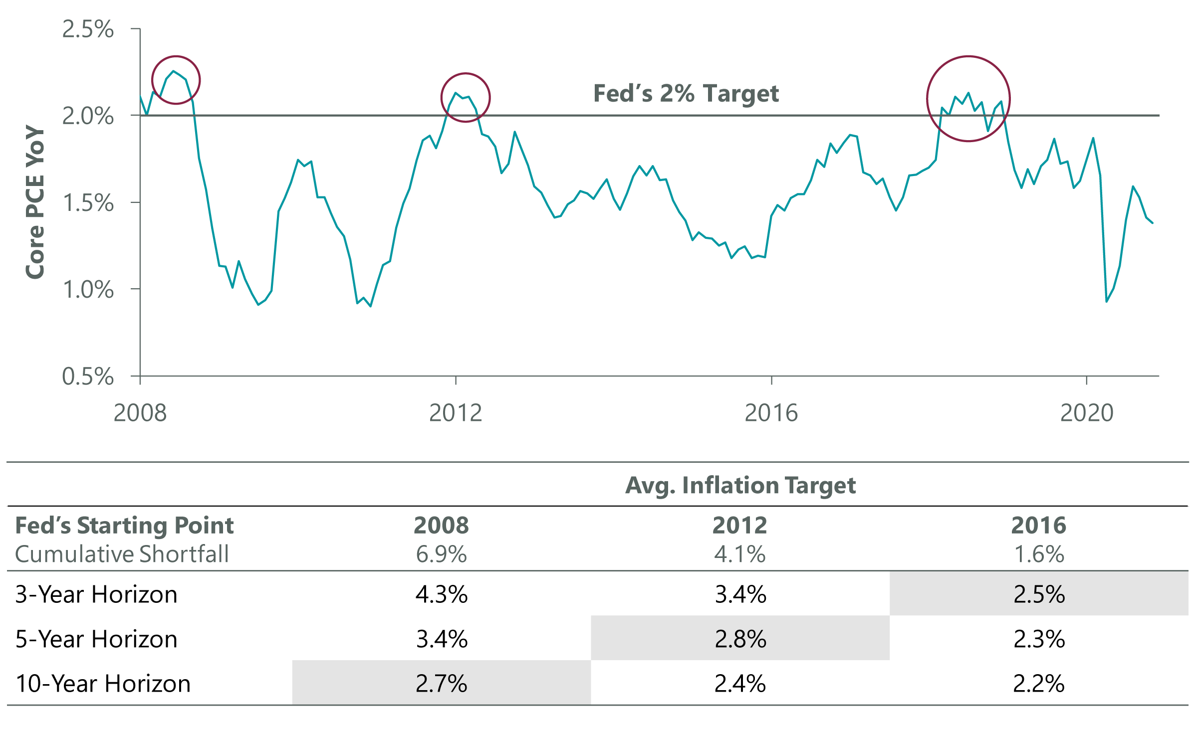
Data as of Nov. 30, 2020, latest available as of Dec. 31, 2020. Source: Federal Reserve Bank of St. Louis, BEA, Bloomberg. Personal Consumption Expenditures (PCE) excluding food and energy.
This is an important development for economic growth as well as financial markets because monetary policy acts with lags. If the Fed will now wait even longer to raise rates in the face of full employment and rising inflation, the implicit outcome should be that Fed policy will remain supportive much longer into an economic cycle than in the past. Over the past 60 years, U.S. economic cycles have followed a general pattern with the economy accelerating out of a recession driven by capital spending and hiring, which leads to rising commodity prices, wages and in turn, inflation. The Fed then typically raises rates to cool the economy, usually overdoing it, which leads to the next recession. In response, the Fed then cuts rates to provide liquidity and resets the cycle.
In the last economic cycle, inflation never materialized despite a 50-year low in the unemployment rate. The Fed began to raise rates irrespective of this starting in December 2015, which now appears to have been a policy error. The Fed looks determined not to make the same mistake twice, and its new framework would allow it to remain accommodative much deeper into an expansion. Looking forward, even though it’s shaping up to be a very different type of recovery, this means the current expansion is less likely to be hampered by monetary tightening, which could create conditions for economic overheating down the road. While the Fed can ultimately change its approach again in the coming years, right now it appears likely that the new framework should help drive better economic growth and be beneficial to risk assets.
Buy the Dip
Although we retain our positive outlook for equities into 2021, it would not be a surprise to see a period of consolidation following the tremendous move off the March lows. Several sentiment gauges show elevated levels of optimism, and positioning looks to be stretched. Put/call ratios reached extremely low levels last month, suggesting less hedging against a pullback. Similarly, bull/bear sentiment ratios are well above three in the Investor’s Intelligence survey, a level consistent with elevated optimism that preceded past pullbacks. However, we believe any pullback in the coming quarter would be an attractive entry point for long-term investors given our expectations that economic growth will remain robust in the coming years, which should support earnings growth and further upside for equities.

Jeffrey Schulze, CFA, ClearBridge Investments, LLC
Related Perspectives
Anatomy of a Recession